Block Editor
All of the information below requires some knowledge of how to use WordPress’ Gutenberg block editor. If you do not know how to use that already, see this helpful article below:
Blocks can be added in any page or post. To add a new block in the editor, simply click into the content and press “Enter” on your keyboard, creating a new line. The “+” icon should come up, which you can click and choose a new block. You can also optionally start typing and it will by default add your typed text into a paragraph block.
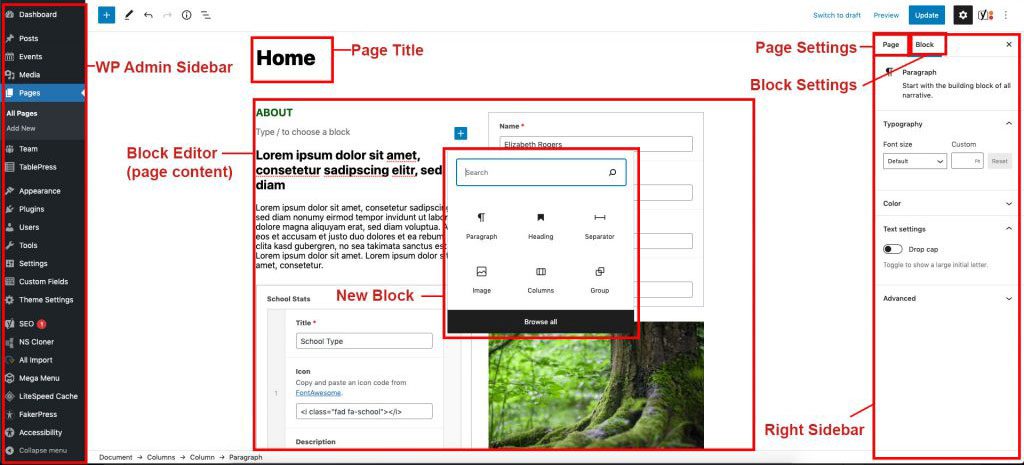
See the diagrams below for a quick outline of the pieces of a single post or page:
Note in the diagrams we have labeled some things:
- Page Title: Define your page title here.
- Block Editor/ Page Editor/ Page Content: This big area is where you lay out your page with blocks and content.
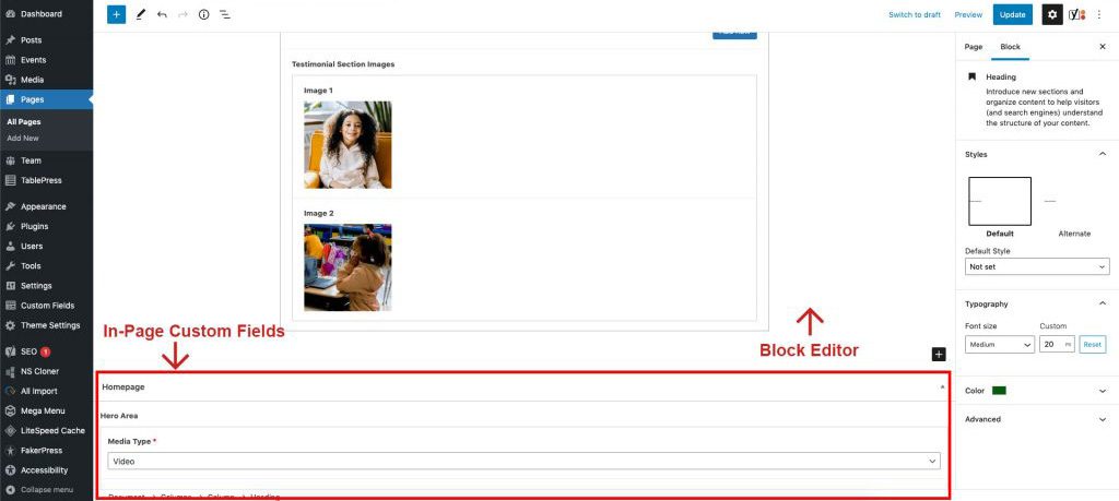
- In-Page Custom Fields: Certain pages and posts will have custom fields you can fill out to complete the layout. These fields are baked into these pages and work independently from blocks.
- Right Sidebar: This holds your Page Settings and Block Settings
- Page settings: This lets you define things in the page such as the featured image, the page slug (url), categories and more.
- Block Settings: These settings pertain to the block you have highlighted in the Block Editor.
- Left Sidebar/ Wp-admin sidebar: This is the navigation for the wordpress backend.
Tip: Since the design of some layouts can have sections flush against each other, it’s highly recommended you make use of the “Spacer” element to add space between certain sections, especially when you have sections that are not within the “Group” element. More on that later.
Important Things to Remember
Copying Blocks Between Pages
If you’ve built a layout on one page and want to reuse it somewhere else, you can copy and paste blocks directly between pages in the editor. Here’s how:
Method 1: Copy & Paste (Recommended)
- Open the source page (the page that has the block you want to copy) in the block editor.
- Click on the block you want to copy. If it’s a Group or Columns block, make sure you select the outermost parent block — not just an inner block. Use the List View (the three stacked lines icon in the top toolbar) to easily see and select the correct parent block.

Selecting Multiple Blocks: You can select more than one block at a time to copy them all at once. Hold Shift and click the first block, then Shift-click the last block to select a range. In List View, this works the same way — Shift-click two blocks to select everything in between. You can also hold Ctrl (Windows) or Cmd (Mac) and click individual blocks to select multiple non-adjacent blocks. All selected blocks will be copied and pasted together.
- Once selected, click the three-dot menu (⋮) in the block toolbar and choose “Copy”. You can also use the keyboard shortcut Ctrl+C (Windows) or Cmd+C (Mac). This works for both single and multiple selected blocks.

- Open the destination page in a new tab or navigate to it.
- Click where you want the block to appear and press Ctrl+V (Windows) or Cmd+V (Mac) to paste. The entire block — including all nested blocks, styles, colors, and settings — will be pasted in.
Method 2: Duplicate to Another Page
- Select the block(s) in the source page.
- Click the three-dot menu (⋮) and choose “Copy block” (or select multiple blocks by holding Shift and clicking the first and last block, then copy).
- On the destination page, you can also paste into a specific spot by clicking on an existing block, pressing Enter to create a new empty line, and then pasting.
Tip: After pasting, always double-check the content, links, and images — they will be exact copies from the original. Update any text or links that should be different on the new page.
Featured Images
(Important!)
For Pages
The featured image set in the page sidebar is used as the background image for the page title/hero banner at the top of each page. A dark overlay is applied automatically so the white title text remains readable. If no featured image is set, the banner defaults to the theme’s primary color (Pantone purple).
The hero section is controlled by these custom fields found below the block editor on each page:
- Disable Page Title — Hides the entire title/hero banner section. Use this when your page content handles its own hero (e.g. via the Homepage Highlights block or a Cover block).
- Alternate Page Title — Overrides the page title displayed in the hero banner and breadcrumb. Useful when you want a shorter or different title than the actual page title.
- Page Hero Description — Adds a short description paragraph below the title in the hero banner (white text, max-width 600px).
- Show Page Breadcrumbs — Toggles the breadcrumb navigation bar above the hero. Breadcrumbs show automatically when the page title is enabled, but this lets you force them on even if the title is disabled.
For Posts (News Articles)
The featured image appears as a standalone image beside the post title and meta info in the header area. It uses a 4:3 crop, so upload images at that aspect ratio for best results.
For Events
The featured image appears in the right column of the single event layout.
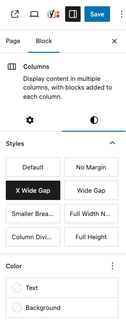
Column Gutter Adjustment (Block Style)
(Important!)
To add more space horizontally between columns, when selecting the columns you are working with in the block editor, in the block settings, click the block styles tab (the half circle icon). You have some predefined styles to choose from. X Wide Gap and Wide Gap should be used liberally to create more space between columns.
Here are all the available Columns block styles:
- X Wide Gap — Adds a large 5em gap between columns. Use this when you need lots of space between columns.
- Wide Gap — Adds a moderate 3em gap between columns. A good default when the standard gap feels too tight.
- No Margin — Removes all margin from the columns block, making it sit flush against adjacent elements.
- Column Dividers — Adds a vertical divider line between each column (3em gap). On mobile, the dividers switch to horizontal lines between stacked columns. When this style is selected, a Divider Color picker appears in the block settings sidebar so you can customize the line color.
- Full Height — Makes the columns block take up 100% of its container’s height. Useful inside Cover blocks or other full-height layouts.
- Full Width No Padding — Removes all internal padding when the columns block is set to full-width alignment. Use this when you want column content to extend edge-to-edge.
- Smaller Breakpoint — Causes the columns to stack into a single column at a smaller screen width than the default. Use when you want columns to stay side-by-side longer on tablets.
Tip: You can combine multiple styles. For example, use “X Wide Gap” together with “Column Dividers” for well-spaced columns with visual separators.
Spacer Block
(Important!)
This block should be used liberally when adding content, to add vertical space. Blocks all have a small gutter between them to adhere to the mosaic design of this site, so many elements may need extra breathing room vertically. The spacer block can be adjusted height-wise by clicking and dragging the dot up or down on the block. 40px is recommended for most situations.
Button Styles
The Button block has several custom styles available beyond the default WordPress options. To apply a style, select a Button block and click the Styles tab (half circle icon) in the right sidebar. Here are all the available button styles:
- Default (Fill) — The standard filled button with the theme’s primary color background.
- Outline — A bordered button with a transparent background. On hover, it fills with the primary color.
- Angled (Donate Style) — A red button with angled elements above and below — this is the style used for donate buttons.
- Transparent Angled — Same angled style but with a transparent background. Text inherits the current color.
- White Angled — The angled style with a white background. Best on dark or colored backgrounds.
- Angled Full Width — A transparent angled button that also adds a horizontal line extending to the left edge.
Examples:
Group Block Styles & Settings
The Group block is used to wrap other blocks together as a section. It has several custom styles and settings in this theme. Select a Group block and click the Styles tab (half circle icon) in the right sidebar to apply a style.
- Thin Content — Constrains the inner content to a max width of 900px — good for text-heavy sections.
- No Padding — Removes all vertical padding from the group. Use when you want sections to sit flush against each other.
- Large Padding — Adds 60px vertical padding to the group.
- Extra Large Padding — Adds 120px padding all around for very spacious sections.
- Shadow Box — Adds a drop shadow and white background so it looks like a card.
- No Expand — Prevents the group from expanding to fill its container’s height.
- Full Width No Padding — Removes all internal padding when the group is set to full-width alignment. Content goes edge-to-edge.
- Full Width With Margins — Makes the group full-width but keeps 40px side margins so content doesn’t touch the screen edges.
- Full Height — Makes the group take up 100% of its container’s height.
- Full Height Center — Makes the group 100% height and vertically centers its content.
- Side Margins 40px — Adds 40px left and right margins to the group.
Group Overlay
Group blocks have a custom Overlay panel in the sidebar. Use this to add a color overlay on top of a background image — helpful for making text on top readable.
- Enable Overlay — Toggle this on to activate the overlay.
- Overlay Color — Pick the color for the overlay (default: black).
- Overlay Opacity — Adjust the opacity from 0 (fully transparent) to 100 (fully opaque). Default is 60.
Tip: A common setup is a Group with a background image + a dark overlay at 50-70% opacity so white text on top is easy to read.
Other Block Styles & Settings
Several other core blocks have custom styles and settings available in this theme. Select the block and click the Styles tab in the right sidebar to apply.
Heading Block
- No Margin — Removes all margin from the heading, making it sit flush against adjacent blocks.
- Light Weight — Changes the heading to a lighter font weight (300) for a more elegant, thin appearance.
Paragraph Block
- No Margin — Removes all margin from the paragraph block.
The Paragraph block also has a custom Max Width setting in the sidebar. Enter a value like 500px, 50%, or 30rem to limit how wide the paragraph gets — handy for keeping text readable in wider layouts.
Column Block (Single Column)
- Border Right — Adds a vertical border on the right side of an individual column.
List Block
- No Indent — Removes the default left indentation from the list, making list items align flush with surrounding text.
Image Block
- Fill Container — Makes the image fill 100% of its container using
object-fit: cover. Inside a Column, the image stretches to fill the whole column area, cropping as needed.
Custom Blocks
This theme includes custom blocks built with Advanced Custom Fields (ACF). You can find them in the block inserter (the + button) — search by name, or type “sperling” to see all of them at once. Below is a reference for each block and its fields.
Homepage Highlights
The homepage hero section — full-width image slider with a heading overlay and feature cards below.
- Hero Slides — A gallery/repeater of images displayed as a rotating slideshow in the hero area.
- Hero Heading — The main heading text overlaid on the hero slider.
- Feature Cards — A repeater of cards displayed below the hero. Each card has an image, title, description, and link.
Example:


PRESERVATION AT WORK
2026 ANNUAL MEETING
The 2026 Annual Meeting will be at the Hawthorne Hotel on Thursday, May 14, 2026.
HOUSE HISTORIES
Has a house plaque ever piqued your interest? Are you doing genealogical research? Or are you simply curious about the historic homes in your neighborhood? Explore HSI’s online repository of House Histories!
GET INVOLVED
Do you have talent, experience, or passion to help preserve Salem? Join one of our volunteer committees today!
Big Slider
A large, full-width image slider. Works well for hero images and banners.
- Gallery — Select or upload images to display in the slider. Images rotate automatically.
Example:


Featured Slider
A smaller image slider for inline galleries or featured photos within page content.
- Slider Images — Select or upload images via the gallery field. They will be displayed in a carousel format.
Example:
Logo Slider
A scrolling logo carousel — logos loop continuously. Used for partner and sponsor logos.
- Logos — Upload or select logo images. They will appear in a continuous scrolling carousel.
Example:


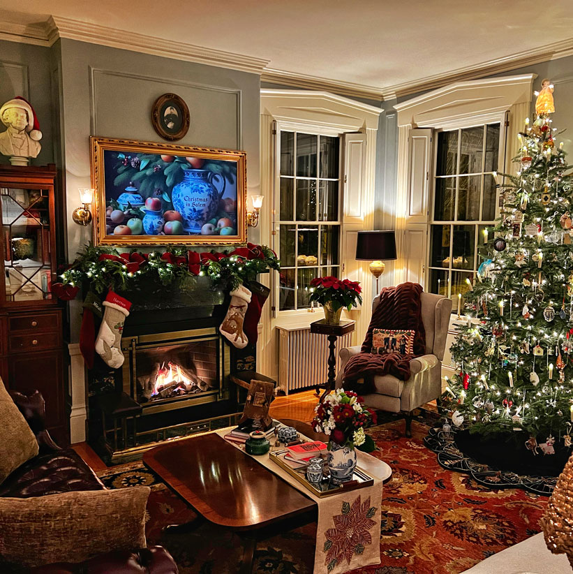
Project Card
A card with an image, title, description, and a CTA button that appears on hover.
- Image — The main card image displayed as the background.
- Project Title — The title text shown on the card.
- Description — A short description that appears on hover.
- Link — The URL the card links to when the CTA button is clicked.
- Max Width — Set a maximum width for the card (in the Settings panel).
- Button Style — Choose the style of the CTA button (in the Settings panel).
- Show Border — Toggle the card border on or off (in the Settings panel).
Example:

Christmas in Salem
Christmas in Salem
Lorem ipsum dolor sit amet, consetetur sadipscing elitr, sed diam nonumy eirmod tempor invidunt ut labore et dolore magna aliquyam erat, sed diam voluptua. At vero eos et accusam et
Project Card Slider
A slider that rotates through multiple project cards. Saves vertical space when you have several projects to show.
- Slides — A repeater field where each row is a project card slide with its own image, title, description, and link.
Example:
Project Title
Project Title
Lorem ipsum dolor sit amet, consetetur sadipscing elitr, sed diam nonumy eirmod tempor invidunt ut labore et dolore magna aliquyam erat, sed diam voluptua. At vero eos et accusam et
Project Title
Project Title
Lorem ipsum dolor sit amet, consetetur sadipscing elitr, sed diam nonumy eirmod tempor invidunt ut labore et dolore magna aliquyam erat, sed diam voluptua. At vero eos et accusam et
Project Title
Project Title
Lorem ipsum dolor sit amet, consetetur sadipscing elitr, sed diam nonumy eirmod tempor invidunt ut labore et dolore magna aliquyam erat, sed diam voluptua. At vero eos et accusam et
Project Title
Project Title
Lorem ipsum dolor sit amet, consetetur sadipscing elitr, sed diam nonumy eirmod tempor invidunt ut labore et dolore magna aliquyam erat, sed diam voluptua. At vero eos et accusam et
Event Card
A card with a Vimeo video embed and an expandable description. Used for event recaps and recorded lectures.
- Vimeo URL — Paste a Vimeo video URL to embed the video player in the card.
- Title — The event or video title.
- Event Date — The date of the event (displayed as formatted text).
- Location — Where the event took place.
- Run Time — The length/duration of the video or event.
- Description — A longer description that can be expanded or collapsed by the viewer.
Example:
Mightier Than A Wrecking Ball: How Ada Louise Huxtable Saved Salem
Events & News
Automatically shows upcoming events and recent news posts side by side. Content is pulled from your published Events and Posts.
- Events Title — Customize the heading for the events column (default: “Upcoming Events”).
- News Title — Customize the heading for the news column (default: “Recent News”).
Example:

Latest News & Events
Like Events & News but with a different look — shows the latest news and an upcoming event on a slate-blue background.
- News Title — Customize the heading for the news column (default: “News”).
- Events Title — Customize the heading for the events column (default: “Events”).
- News CTA Label — Customize the call-to-action button text for the news section.
- Events CTA Label — Customize the call-to-action button text for the events section.
Example:
FAQ Accordion
A collapsible accordion for FAQs. Click a question to expand or collapse the answer.
- FAQ Items — A repeater field where each row has a Question and an Answer.
- Block Styles — Two visual styles are available in the Styles panel: Outlined (bordered items) and Boxed (filled background items).
Example:
How do I purchase tickets for Christmas in Salem?
You can purchase your tickets here.
Can I take pictures inside the homes?
Yes! Most homes allow photos. Please pay attention to guide instructions as a few homes do not allow photography. Please tag @historicsaleminc on social media and use the tag #christmasinsalem.
Are children allowed on the tour?
Children under the age of 6 are not allowed on the tour unless they are in a baby carrier. Children 6 and older are welcome to attend the tour but must have their own ticket.
Can a large group attend together?
Yes! Tickets are not timed. You can start the tour at any time, at any house. Efforts will be made to allow entrance to a group of 10 or fewer into the house at the same time. Larger groups may need to view the house in smaller groups one after another.
Can I bring my umbrella/backpack/shopping bags into the houses?
No, backpacks and other large parcels can cause inadvertent damage to the homes. Any large parcel deemed hazardous to home decor cannot be brought inside the houses. We have a guide at the front door who will try to keep an eye on it, but we cannot be held responsible for your things.
Can I bring my pet with me?
No, pets cannot be brought inside the houses on the tour.
Where are the restrooms?
No use of private restrooms in homes on the tour is allowed.
What kind of footwear is best for the tour?
The tour requires a significant amount of walking so wear comfy shoes. To preserve the integrity of many homes wood floors, we ask that you refrain from wearing high-heels.
How accessible are the homes?
Most of the home tours cover one floor of the home but most homes are accessed via a few front steps. On occasion, a tour may cover a second floor. If you are uncomfortable with stairs, you can exit before heading up, or down.
Community Quotes
A rotating quote/testimonial slider with decorative leaf elements.
- Section Title — The heading displayed above the quotes (default: “Community Quotes”).
- Show Background — Toggle the decorative background on or off.
- Quotes — A repeater field where each row is an individual quote/testimonial.
Example:
Stats Counter
Shows statistics with animated counting numbers that count up when scrolled into view.
- Stats — A repeater field where each row has a number and a label. The number animates from 0 to the target value when visible.
Example:
Anchor Menu
A sticky navigation bar for long pages — clicking an item scrolls to that section.
- Menu Items — Each item has a label (the visible text) and an anchor/ID (the HTML ID of the section to scroll to). Make sure the target section has a matching HTML Anchor set in its block settings under Advanced.
Example:
Google Map
Embeds a Google Map with a marker at a specified location.
- Map Location — Search for and select a location using the ACF Google Map field.
- Map Zoom — Set the zoom level (default: 15). Higher numbers = more zoomed in.
- Map Height — Set the map height in pixels (default: 450).
- Marker Title — Text that appears when hovering over the map marker.
Example:
Image Badge
Shows an image with a badge or icon in the top-right corner.
- Image — The main image to display.
- Badge — A smaller image or icon that appears overlaid at the top-right corner of the main image.
Example:

Little Green Light Form
Embeds donation or sign-up forms from Little Green Light.
- Form Script — Paste the Little Green Light form embed script/code here. The block will render the form on the front end of the site.
Example:
Email & Phone Links
You can make email addresses and phone numbers clickable so visitors can easily contact you. Here’s how to set up these special links:
Email Links (mailto:)
To make an email address clickable (opens the visitor’s email app):
- Select the text you want to turn into a link (e.g., “info@historicsalem.org” or “Contact Us”)
- Click the link icon in the toolbar (or press Ctrl+K / Cmd+K)
- In the URL field, type:
mailto:followed by the email address - Example:
mailto:info@historicsalem.org
Phone Links (tel:)
To make a phone number clickable (initiates a call on mobile devices):
- Select the text you want to turn into a link (e.g., “(978) 745-0799” or “Call Us”)
- Click the link icon in the toolbar (or press Ctrl+K / Cmd+K)
- In the URL field, type:
tel:followed by the phone number (numbers only, no spaces or dashes) - Example:
tel:9787450799
Tip: You can use these link types on any text — buttons, paragraphs, list items, etc. The display text can be anything (like “Email Us” or “Give Us a Call”), while the link itself contains the mailto: or tel: URL.
Theme Settings
The Theme Settings page is in the WordPress admin sidebar. These are global options that affect the whole site.
Announcement Bar
A banner at the top of every page, above the navigation. Use it for temporary messages or important notices.
- Show Announcement Bar — Toggle this on to display the announcement bar across the entire site. Toggle off to hide it.
- Announcement Bar — Enter the text/HTML content for the bar. This appears as white text on a red background, centered on the page.
Company Information
These fields populate the footer’s contact section across the entire site.
- Company Phone — The phone number displayed in the footer. It automatically becomes a clickable “tel:” link on mobile devices.
- Company Email — The email address displayed in the footer. Automatically becomes a clickable “mailto:” link.
- Company Address — The physical address displayed in the footer.
Company Social Links
A repeater field that lets you add social media icons and links to the footer. Each row has:
- Icon Code — Paste Font Awesome icon HTML (e.g.
<i class="fa-brands fa-facebook"></i>). Browse icons at fontawesome.com/icons. - Link — The URL to the social media profile.
Click “Add Row” to add more social links, or remove rows to delete them.
Sponsors
Sponsor logos that show up in the “Thank You to Our Sponsors” strip above the footer. Each row takes an Image — just upload the logo. Add or remove rows as needed.
Menus
The site’s navigation menus are managed under Appearance → Menus in the WordPress admin.
Header Menu (Primary Navigation)
This is the main navigation bar that appears across the top of every page. It displays the top-level pages and their dropdown submenus.
- Location: Top of the site, in the header bar next to the logo.
- Adding items: In the Menus screen, select pages, posts, custom links, or categories from the left column and click “Add to Menu”. Drag items to reorder them.
- Creating dropdowns: Drag a menu item slightly to the right underneath another item to make it a sub-item (child). This creates a dropdown menu on hover.
- Custom links: Use Custom Links to add external URLs or anchor links (e.g.
#section-id) to the navigation.
How to Edit Menus
- Go to Appearance → Menus in the WordPress admin sidebar.
- Select the menu you want to edit from the “Select a menu to edit” dropdown, or create a new one.
- Add pages, posts, custom links, or categories from the left panel by checking them and clicking “Add to Menu”.
- Drag and drop items to reorder. Drag items to the right to create dropdown sub-items.
- Under “Menu Settings” at the bottom, check the Display location box to assign the menu to a theme location (Header Menu).
- Click “Save Menu” when done.
Tip: To open a link in a new tab, expand the menu item by clicking the arrow on the right, then check “Open link in a new tab”. If you don’t see this option, click “Screen Options” at the top of the page and enable “Link Target”.
Events
Events on this site are managed using The Events Calendar plugin. Events are a separate content type from pages and posts — they have their own section in the WordPress admin.
Creating & Editing Events
- Go to Events in the WordPress admin sidebar.
- Click “Add New” to create a new event, or click on an existing event to edit it.
- Fill in the event details:
- Title — The name of the event.
- Date & Time — Set the start and end date/time for the event. You can also mark it as an all-day event.
- Venue — The location where the event takes place. You can create and reuse venues.
- Organizer — The person or organization hosting the event.
- Event Website — An optional link to an external event page or registration.
- Cost — The price or “Free” for the event.
- Featured Image — Set a featured image in the right sidebar. This image appears in the event listing and on the single event page.
- Content Area — Use the block editor below the title to add a description, images, or any other content to the event.
Events Display
- Events List Page — The plugin automatically generates an events listing page that shows upcoming events. Past events are automatically hidden from the listing.
- Events & News Block / Latest News & Events Block — These custom blocks (covered in the Custom Blocks section) automatically pull upcoming events into page layouts.
Tip: Past events are automatically excluded from the sitemap for SEO purposes. The events list view shows up to 50 events per page.
Recommended Image Sizes
The theme has custom image crop sizes. WordPress automatically generates these cropped versions whenever you upload an image. Here’s a reference of each size and where it’s used.
Custom Image Crop Sizes
| Crop Name | Dimensions | Aspect Ratio | Where It’s Used |
|---|---|---|---|
| 16:9 | 800 × 450 px | Widescreen (16:9) | General widescreen content areas |
| 16:9 Large | 2000 × 1125 px | Widescreen (16:9) | Hero banners, full-width backgrounds |
| 4:3 | 800 × 600 px | Standard (4:3) | News/blog post thumbnails |
| 4:3 Large | 2000 × 1500 px | Standard (4:3) | Large featured images |
| 3:2 | 800 × 533 px | Classic photo (3:2) | General image blocks |
| 3:2 Large | 2000 × 1333 px | Classic photo (3:2) | Big Slider block images |
| Square | 800 × 800 px | Square (1:1) | Profile photos, icons, thumbnails |
| Short & Long | 2000 × 745 px | Wide banner (~2.7:1) | Thin banner/strip sections |
| Portrait | 800 × 1066 px | Portrait (~3:4) | Portrait-oriented images, team photos |
Best Practices for Uploading Images
- Upload larger than the crop size — Always upload images that are at least as large as the biggest crop that will be used. For full-width backgrounds and hero images, upload at least 2000px wide.
- Match the aspect ratio — If the image will be cropped to 16:9, make sure the important parts of the photo are centered so nothing gets cut off.
- Featured images for posts — Blog/news posts use the 4:3 (800×600) crop for thumbnails on listing pages. Upload images at least 800×600.
- Optimize file size — Compress images before uploading to keep page load times fast. Tools like TinyPNG or Squoosh can reduce file size without visible quality loss.
- Use JPG for photographs — JPG/JPEG is best for photos with many colors. Use PNG only for images that need transparency (logos, icons).
Tip: After uploading an image, WordPress automatically generates all the crop sizes listed above. You don’t need to manually resize — just make sure the original image is large enough.


